AT&T
Collaborate
UX Design & Instructional Video Production · AT&T · 2016
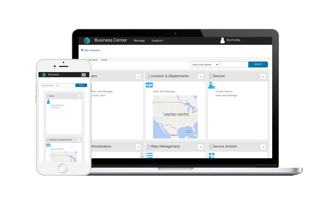
AT&T Collaborate is an enterprise-grade unified communications platform designed for business customers. It brings together voice, video, instant messaging, and conferencing into a single seamless experience, eliminating the friction that comes from toggling between disconnected tools. For IT administrators and business owners, it represents a smarter way to manage how their organization communicates.
AT&T's cloud-based B2B communications product had a presentation problem. The platform itself was capable, but the web experience surrounding it was dated, visually sparse, and failing to communicate its value. Company administrators, the people responsible for deploying and managing the product across their organizations, had no clear, engaging way to learn what Collaborate could actually do for them.
The result was predictable:
- Features went undiscovered. Underutilization was the norm.
- Investments went unrealized despite the platform's actual capability.
- IT decision-makers lacked the confidence they needed to fully adopt and advocate for the platform.
I was brought in to solve two connected challenges: redesign the product experience to be visually engaging and intuitively navigable, and produce a demonstration video that would walk business administrators through one of Collaborate's most practical features: Key System Emulation.
Both deliverables pointed at the same underlying problem: the gap between what Collaborate could do and what its users understood it could do. Closing that gap required both better design and better instruction.
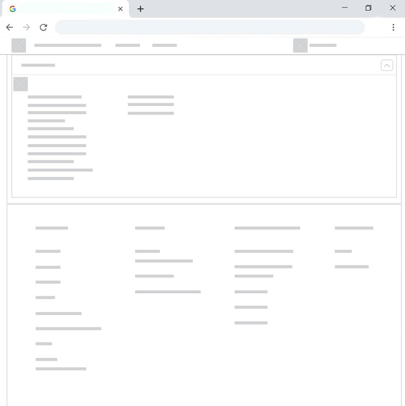
I began by exploring a range of editing styles and interface templates, looking for patterns that could support reusable components across the experience. Given the project's timeline, I anchored the design philosophy around clarity. An uncluttered, focused environment would serve administrators better than a feature-heavy layout.
"Every decision was filtered through one question: Does this help a busy IT professional get to what they need faster?"
Design Principle, AT&T Collaborate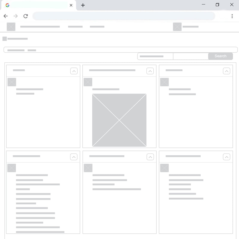
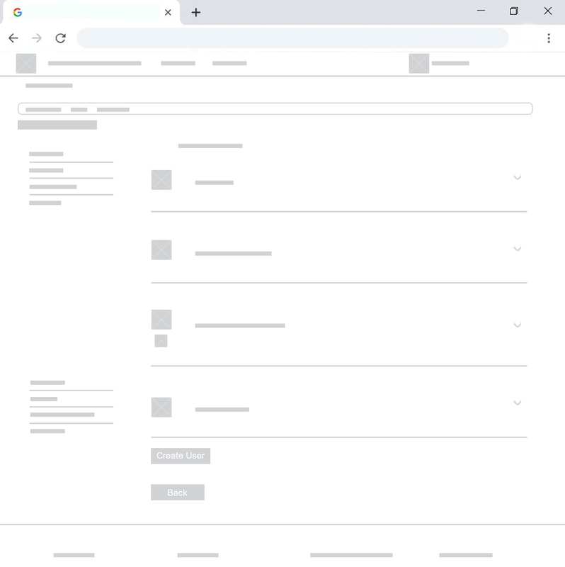
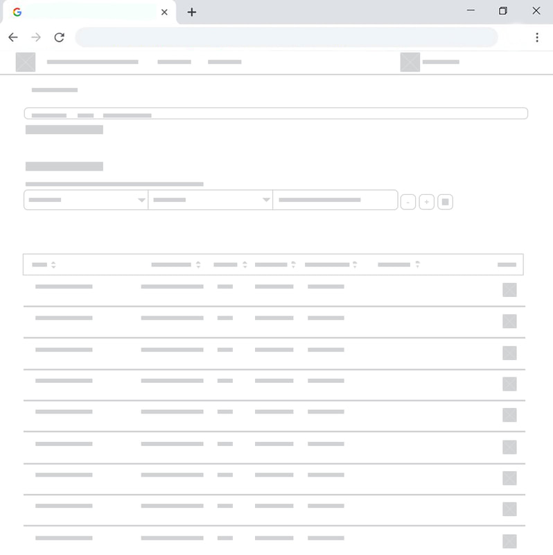
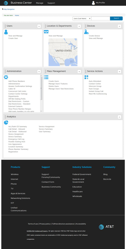
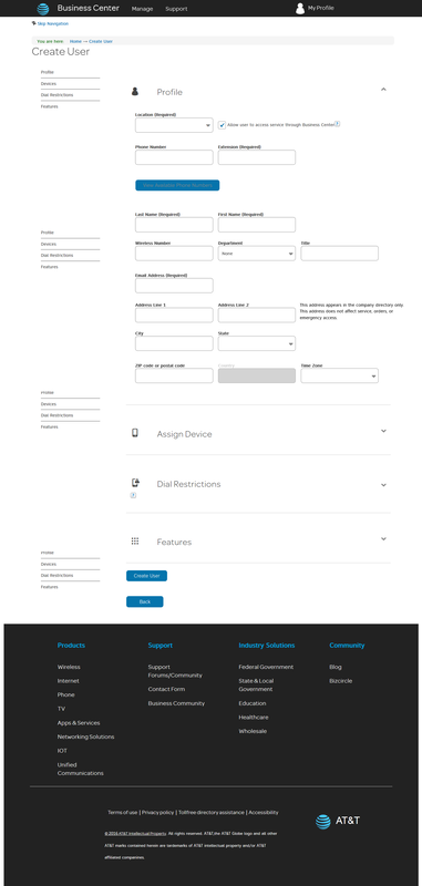
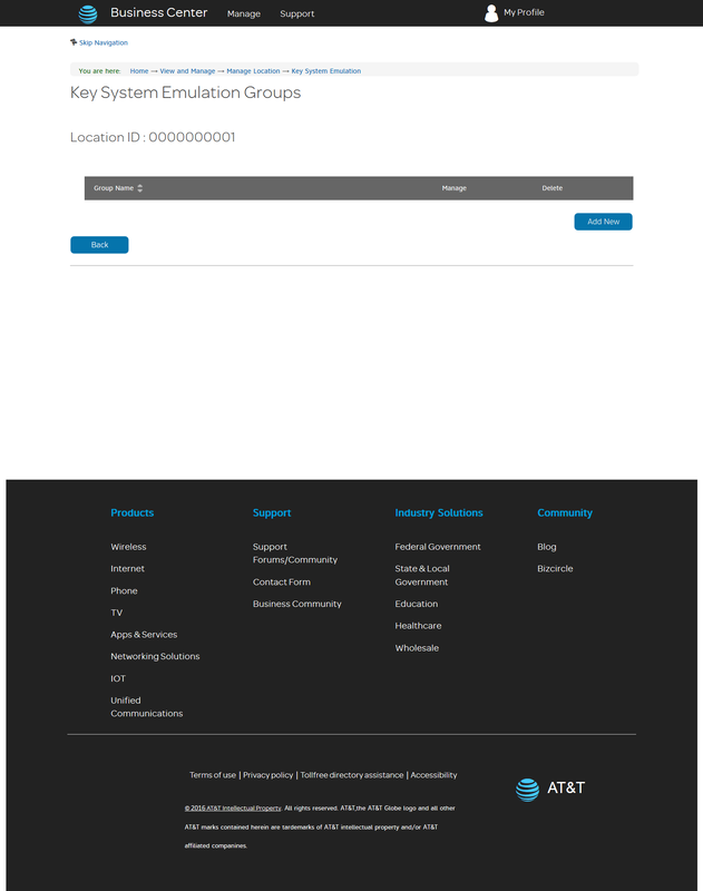
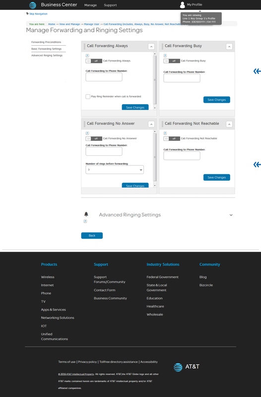
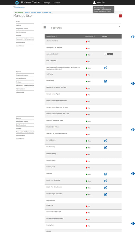
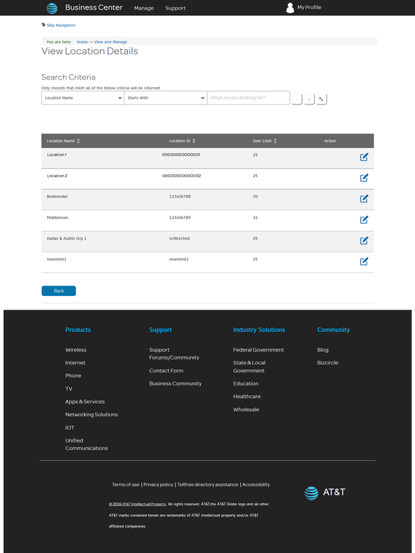
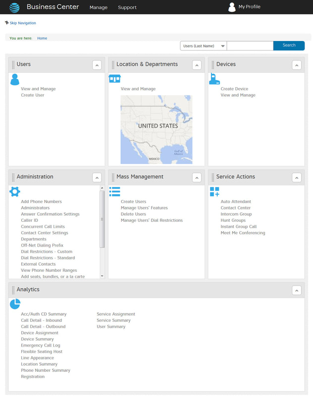
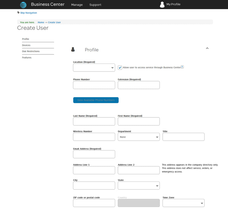
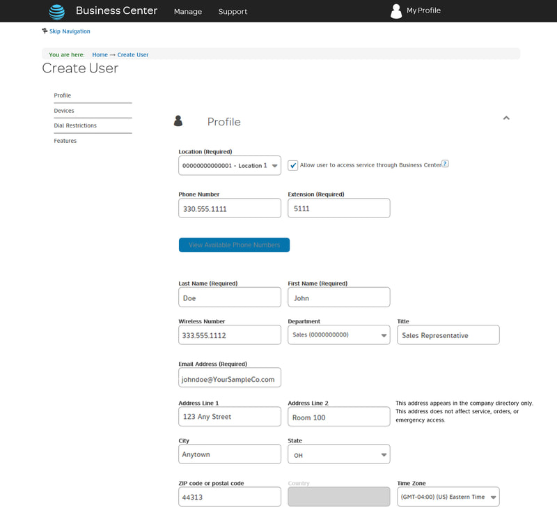
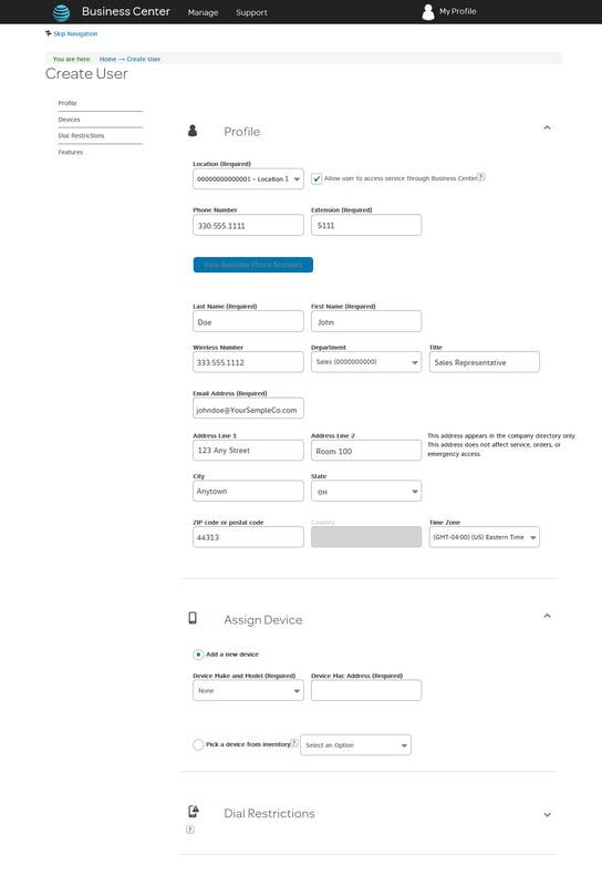
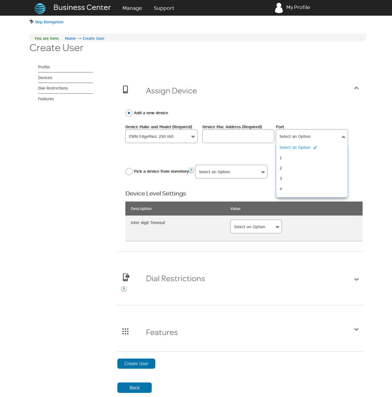
The onboarding flow centered on one of the most common administrator tasks: creating a user. Rather than overwhelming admins with options upfront, I designed a guided, step-by-step process that walked them through the task in a deliberate sequence.
Complete User Profile
Capture essential identity and contact information in a clean, minimal form.
Assign a Device
Connect the user to their hardware or softphone configuration.
Review Features
Surface the features available to that user's plan in a digestible overview.
Submit
Confirm and activate, with clear feedback that the task completed successfully.
The goal was to make a technically complex task feel approachable, reducing errors, reducing calls to support, and building administrator confidence in the platform from day one.
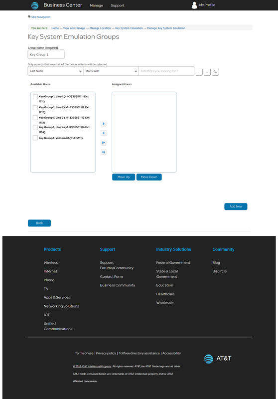
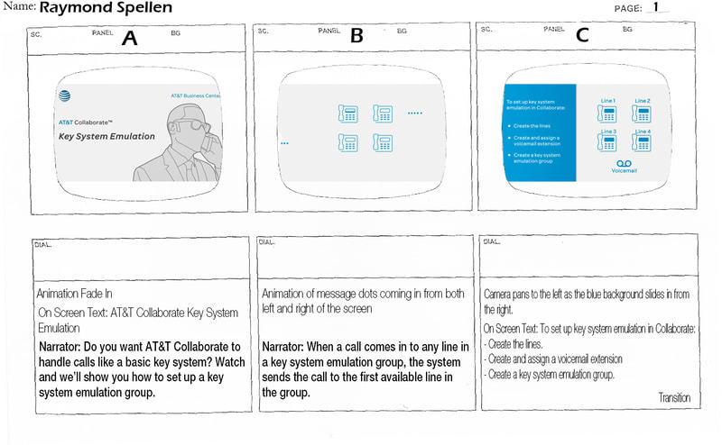
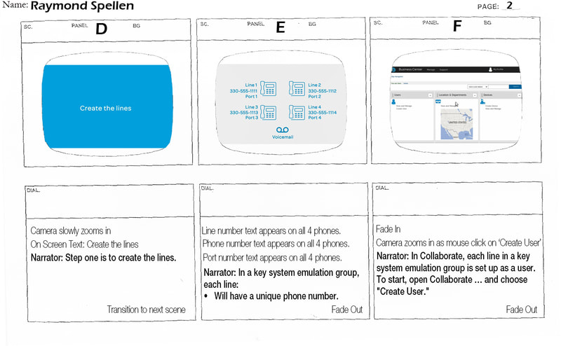
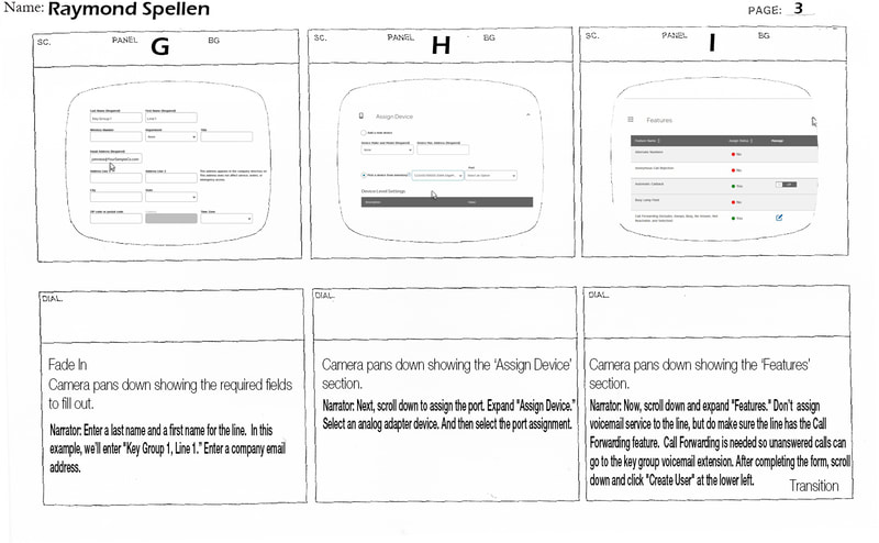
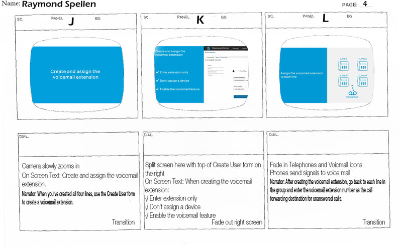
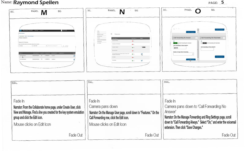
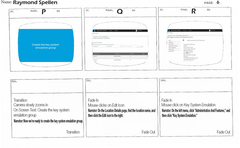
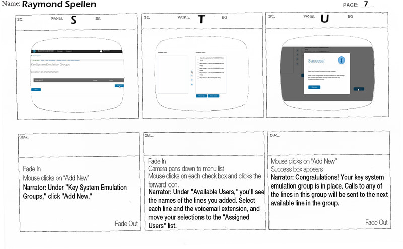
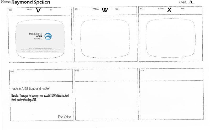
Parallel to the interface work, I developed a storyboard for the Key System Emulation demonstration video, a resource aimed at business owners who wanted to configure Collaborate to function like a traditional key phone system.
My approach fused two formats: the visual clarity of an infographic with the utility of a how-to guide. The storyboard was the tool I used to take every idea in my head and shape it into a single, disciplined narrative before a single frame was produced. Structure first, execution second.
The final video walked viewers through setting up call-handling lines in Collaborate step by step, translating a technical configuration process into something a non-technical business owner could follow and execute independently.
This project sat at the intersection of two disciplines I care deeply about: visual design and instructional communication. The challenge wasn't just making something look better. It was making something work better for the people who depended on it.
From a business impact standpoint, the work addressed a real cost center. When administrators can't independently learn and configure a platform, they turn to support channels. Every support ticket has a price. By creating a more intuitive onboarding experience and a self-serve demonstration video, the project contributed directly to reducing that dependency, lowering support overhead and increasing the likelihood that customers would fully leverage the features they were already paying for.
For AT&T's B2B division, a customer who understands the product is a customer who stays. The redesign and video were more than UX improvements. They were retention tools.
"The best design doesn't call attention to itself. It quietly removes the obstacles between a person and what they're trying to accomplish."
TakeawayProtecting Client Confidentiality
Throughout my career, I’ve partnered with organizations across healthcare, financial services, technology, and telecommunications to design learning experiences, digital products, and communication campaigns.
Because much of this work contains proprietary information, internal processes, or confidential business content, the portfolio examples presented here have been selectively edited. Rather than displaying complete courses or full project deliverables, I’ve included representative sections that demonstrate my design thinking, creative approach, and technical execution while honoring the confidentiality and trust of the organizations I’ve worked with.
Protecting client information is just as important as showcasing my work.